How do your Sales Managers currently track deals through the Sales Process?
If they’re like most sales managers they are confined to using whatever information the CRM provides, which is often not much. The only thing the CRM provides is the phase/stage of the sales cycle, it does not provide them with any insights as to how the sales rep is performing and if the sales rep is progressing well with the deal.
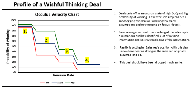
The Occulus Velocity Chart, which is an important component of the Deal Analysis, solves that problem for you. The Velocity Chart provides you with a visual indication of how quickly the sales rep is qualifying the deal along the Winning Dimension and the velocity at which the sales rep is moving the deal through the sales process to a successful close.
The Velocity Chart
The Vertical Axis represents the Probability of Winning The Horizontal Axis is time.
There are 3 lines on the Velocity Chart:
- the Probability of Winning the Deal (Score; Blue Line)
- the Uncertainty in the Probability of Winning as represented by the difference between:
- the High value of the Winning Probability (Green Line)
- the Low value of the Winning Probability (Red Line)
- the gap between the High (Green) and Low (Red) is a direct indicator of how well the deal is qualified.


Using the Velocity Chart To Identify issues with Other Deals